


Fintech App
Understanding The Problem
To structure my approach, I broke down the prompts into key questions aimed at addressing crucial questions:
- Transaction Frequency on the Go:
- How often do users engage in transactions while on the move?
- Transaction Geographics
- Are these transactions predominantly local or international in nature?
- Proximity-Driven Features
- What features are deemed essential for executing transactions based on proximity?
- Trust in Transactions
- How can users be assured that their transactions are secure, trustworthy, and executed in a timely manner?
I conducted user interviews with people across various income brackets, guiding the conversations to extract valuable perspectives. I then created an affinity diagram with post-its to organize key ideas that came out of these conversations.
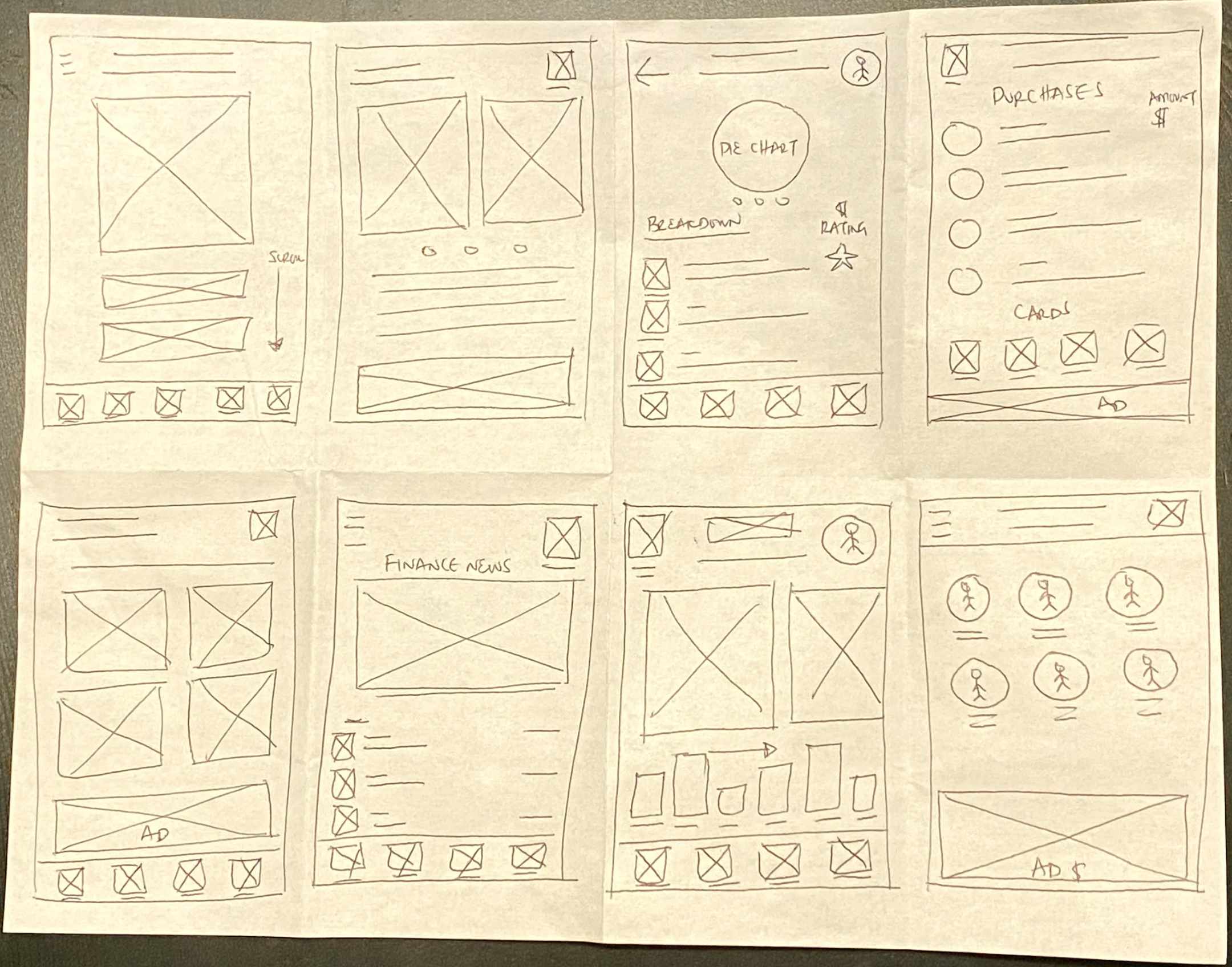
Paper Wireframes
I started with crafting a paper wireframe to serve as the foundation of my design. With a focus on simplicity and quick ideation, my sketches allowed for the rapid exploration of layout and structure, fostering early visualization of the user interface. This low-fidelity approach facilitates easy iteration and collaboration, enabling the team to thoroughly discuss the information architecture and concerns before delving into more time consuming and involved design steps.
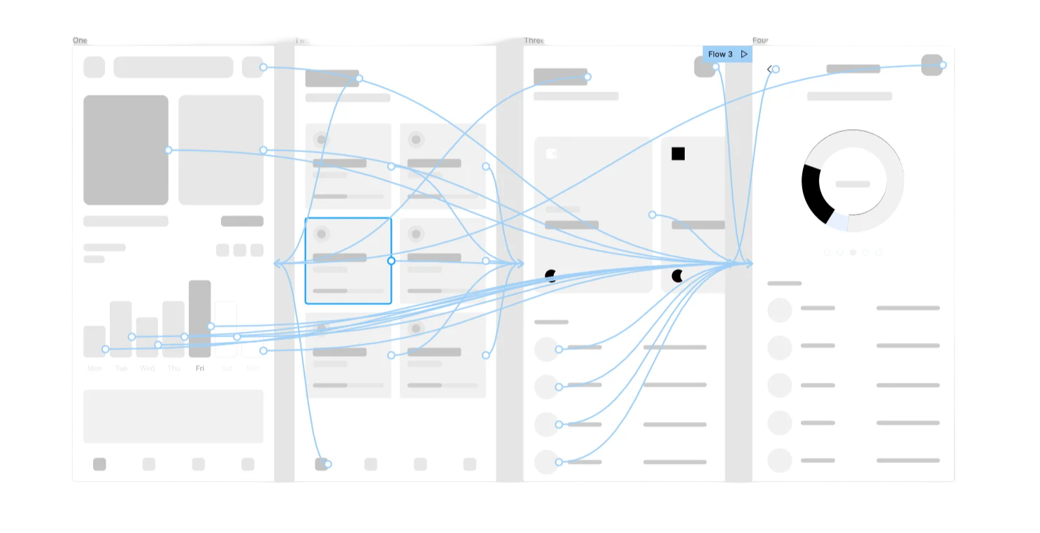
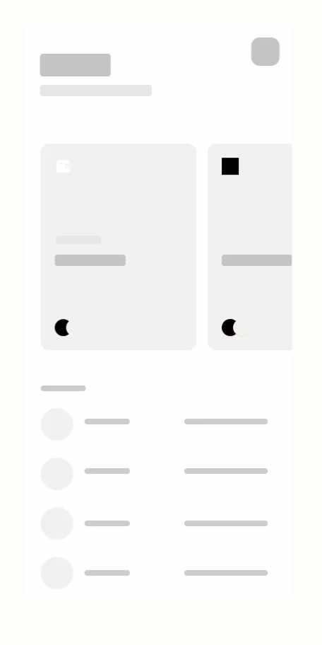
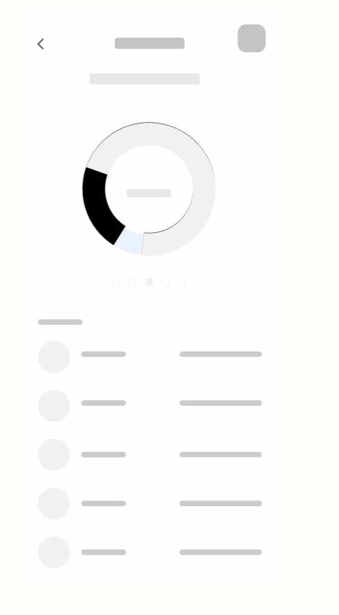
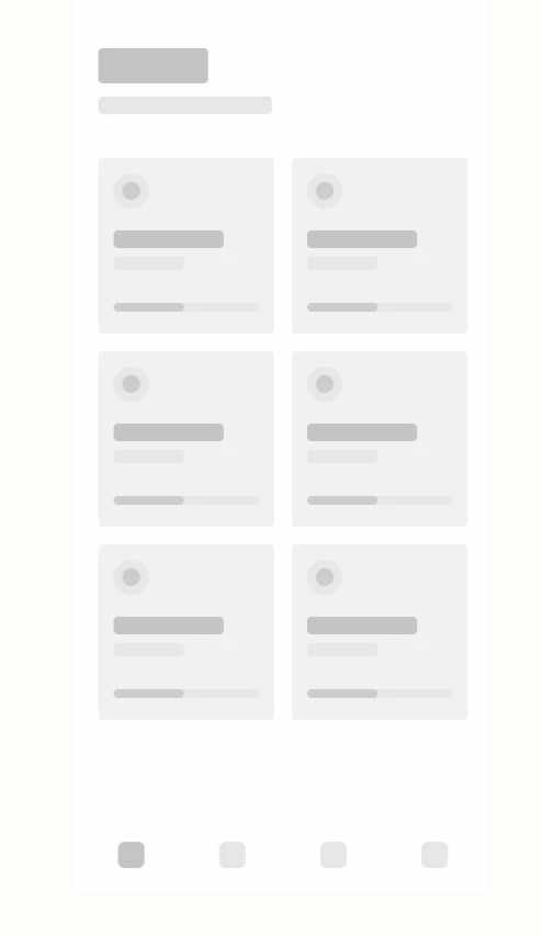
Low-Fidelity Prototype
During the lo-fi prototype design phase, I focused more on the visual appearance and transition fluency while making sure the user experience would foster a feeling of trust and confidence.
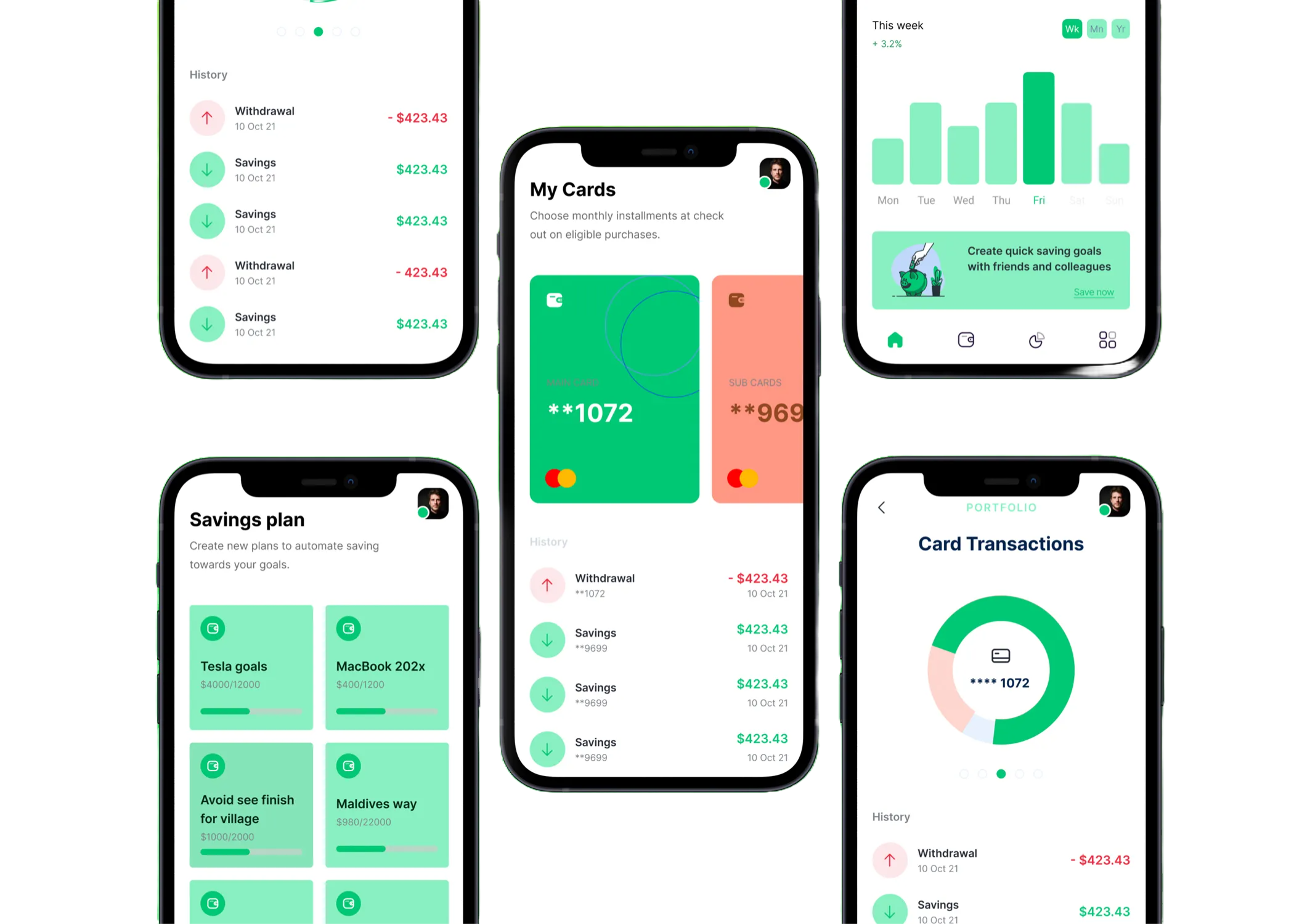
High-Fidelity Mockups
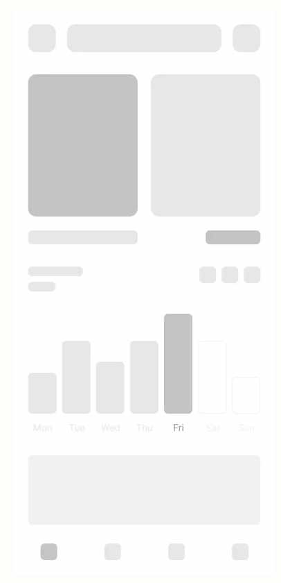
While initial designs centered around providing users with a comprehensive overview of their expenses on a weekly basis, usability studies revealed a shift in user preference. Users expressed a stronger inclination towards accessing their most current expenses rather than a weekly summary.
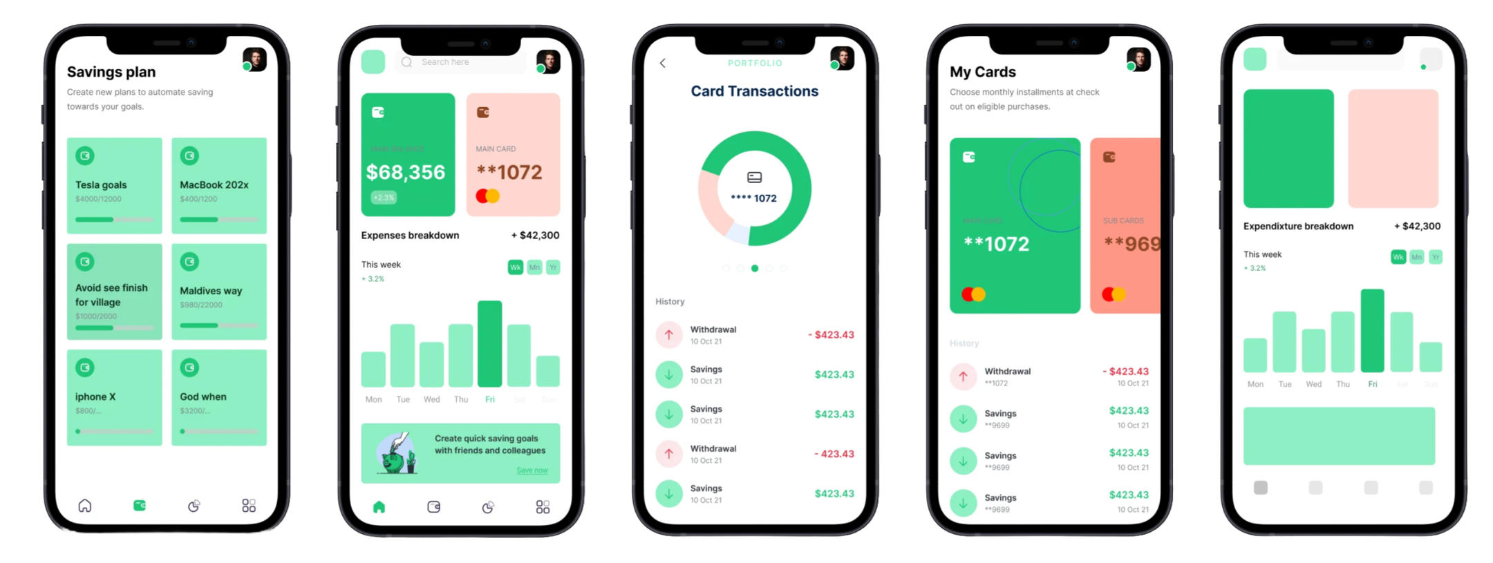
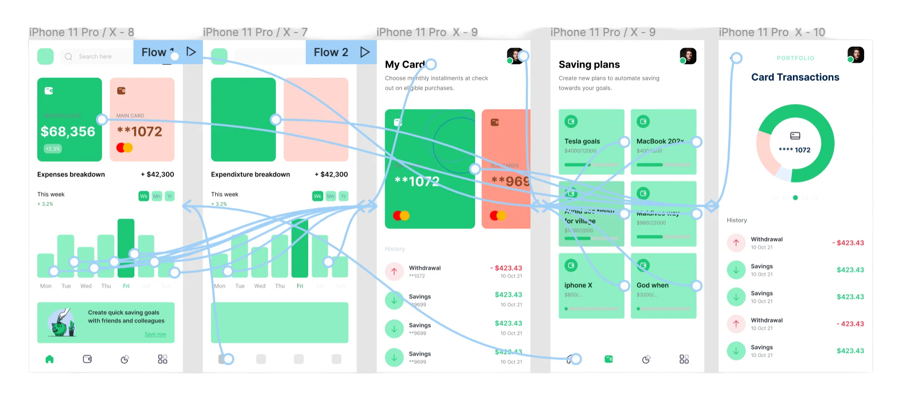
High-Fidelity Prototype
The final hi-fi prototype presented a better user flow and provided a more efficient way to monitor user account balances.
Lesson Learned
My learning process has emphasized the importance of embracing diverse alternatives and thoroughly analyzing their respective pros and cons. In design, decisions often involve trade-offs between multiple considerations, with the ultimate choice hinging on the core needs of the user and the specific usage context. This openness to exploration and careful consideration of trade-offs has become a foundational principle in my process, guiding a more nuanced and user-centric approach to my designs.
Digital Wireframes
As the initial design phase continued, I progressed in the wireframes, making sure to base the screen designs on findings and feedback from user research.
Pain Points
- Data: Users need to understand the data, which will help with the monitoring process.
- Accessibility: Users need the ability to view all their card balances and purchases.
Developing Use Cases
In the iterative design process, I created use cases and personas to compile a comprehensive list of features essential for the best user experience.
To gain a more tangible understanding of the user flow and preliminary structure, I employed the "crazy 8's" method, engaging in rapid sketching sessions.
Restart projects
Enertiv App


Fintech App
Understanding The Problem
To structure my approach, I broke down the prompts into key questions aimed at addressing crucial questions:
- Transaction Frequency on the Go:
- How often do users engage in transactions while on the move?
- Transaction Geographics
- Are these transactions predominantly local or international in nature?
- Proximity-Driven Features
- What features are deemed essential for executing transactions based on proximity?
- Trust in Transactions
- How can users be assured that their transactions are secure, trustworthy, and executed in a timely manner?
I conducted user interviews with people across various income brackets, guiding the conversations to extract valuable perspectives. I then created an affinity diagram with post-its to organize key ideas that came out of these conversations.
Paper Wireframes
I started with crafting a paper wireframe to serve as the foundation of my design. With a focus on simplicity and quick ideation, my sketches allowed for the rapid exploration of layout and structure, fostering early visualization of the user interface. This low-fidelity approach facilitates easy iteration and collaboration, enabling the team to thoroughly discuss the information architecture and concerns before delving into more time consuming and involved design steps.
Low-Fidelity Prototype
During the lo-fi prototype design phase, I focused more on the visual appearance and transition fluency while making sure the user experience would foster a feeling of trust and confidence.
High-Fidelity Mockups
While initial designs centered around providing users with a comprehensive overview of their expenses on a weekly basis, usability studies revealed a shift in user preference. Users expressed a stronger inclination towards accessing their most current expenses rather than a weekly summary.
High-Fidelity Prototype
The final hi-fi prototype presented a better user flow and provided a more efficient way to monitor user account balances.
Lesson Learned
My learning process has emphasized the importance of embracing diverse alternatives and thoroughly analyzing their respective pros and cons. In design, decisions often involve trade-offs between multiple considerations, with the ultimate choice hinging on the core needs of the user and the specific usage context. This openness to exploration and careful consideration of trade-offs has become a foundational principle in my process, guiding a more nuanced and user-centric approach to my designs.
Digital Wireframes
As the initial design phase continued, I progressed in the wireframes, making sure to base the screen designs on findings and feedback from user research.
Pain Points
- Data: Users need to understand the data, which will help with the monitoring process.
- Accessibility: Users need the ability to view all their card balances and purchases.
Developing Use Cases
In the iterative design process, I created use cases and personas to compile a comprehensive list of features essential for the best user experience.
To gain a more tangible understanding of the user flow and preliminary structure, I employed the "crazy 8's" method, engaging in rapid sketching sessions.
Restart projects
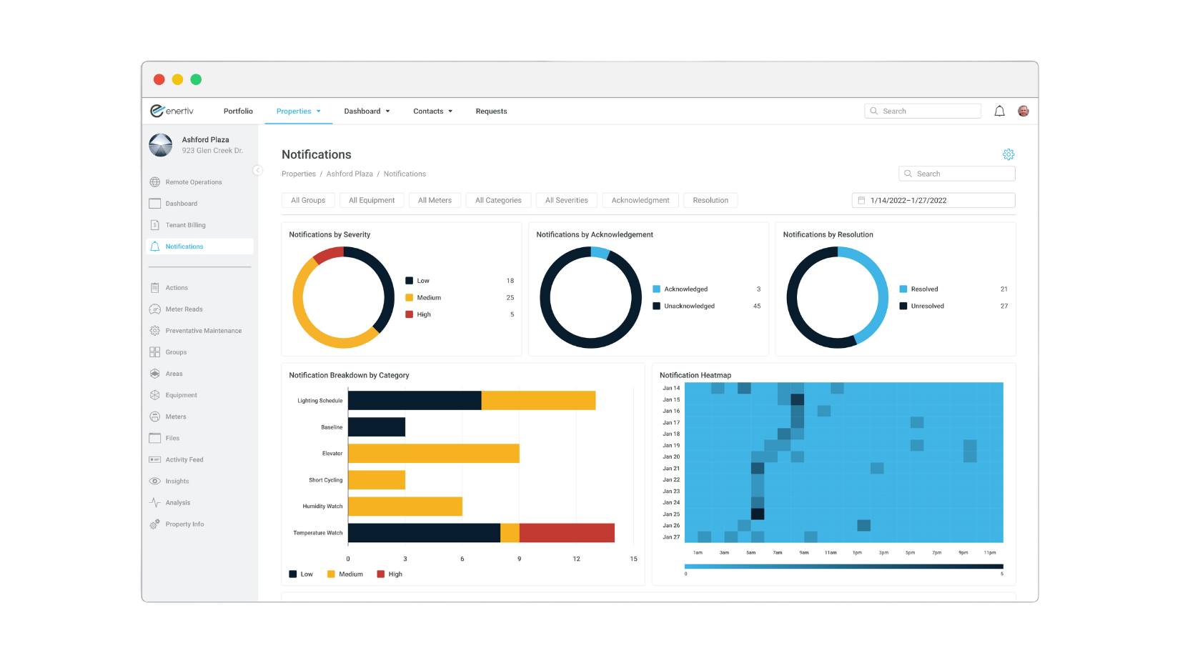
Enertiv App
Fintech App
Understanding The Problem
To structure my approach, I broke down the prompts into key questions aimed at addressing crucial questions:
- Transaction Frequency on the Go:
- How often do users engage in transactions while on the move?
- Transaction Geographics
- Are these transactions predominantly local or international in nature?
- Proximity-Driven Features
- What features are deemed essential for executing transactions based on proximity?
- Trust in Transactions
- How can users be assured that their transactions are secure, trustworthy, and executed in a timely manner?
I conducted user interviews with people across various income brackets, guiding the conversations to extract valuable perspectives. I then created an affinity diagram with post-its to organize key ideas that came out of these conversations.
Paper Wireframes
I started with crafting a paper wireframe to serve as the foundation of my design. With a focus on simplicity and quick ideation, my sketches allowed for the rapid exploration of layout and structure, fostering early visualization of the user interface. This low-fidelity approach facilitates easy iteration and collaboration, enabling the team to thoroughly discuss the information architecture and concerns before delving into more time consuming and involved design steps.
Low-Fidelity Prototype
During the lo-fi prototype design phase, I focused more on the visual appearance and transition fluency while making sure the user experience would foster a feeling of trust and confidence.
High-Fidelity Mockups
While initial designs centered around providing users with a comprehensive overview of their expenses on a weekly basis, usability studies revealed a shift in user preference. Users expressed a stronger inclination towards accessing their most current expenses rather than a weekly summary.
High-Fidelity Prototype
The final hi-fi prototype presented a better user flow and provided a more efficient way to monitor user account balances.
Lesson Learned
My learning process has emphasized the importance of embracing diverse alternatives and thoroughly analyzing their respective pros and cons. In design, decisions often involve trade-offs between multiple considerations, with the ultimate choice hinging on the core needs of the user and the specific usage context. This openness to exploration and careful consideration of trade-offs has become a foundational principle in my process, guiding a more nuanced and user-centric approach to my designs.
Digital Wireframes
As the initial design phase continued, I progressed in the wireframes, making sure to base the screen designs on findings and feedback from user research.
Pain Points
- Data: Users need to understand the data, which will help with the monitoring process.
- Accessibility: Users need the ability to view all their card balances and purchases.
Developing Use Cases
In the iterative design process, I created use cases and personas to compile a comprehensive list of features essential for the best user experience.
To gain a more tangible understanding of the user flow and preliminary structure, I employed the "crazy 8's" method, engaging in rapid sketching sessions.
Restart projects
Enertiv App