


Universe Dashboard
Redesigning How Event Organizers Access and Analyze Data
Event organizers have traditionally used Universe because of its reliability in setting up events quickly and selling tickets.
However, we found that the support beyond the event launch was lacking. Once an event concludes, we wanted to organizers to be able to track their success and optimize for their next event.
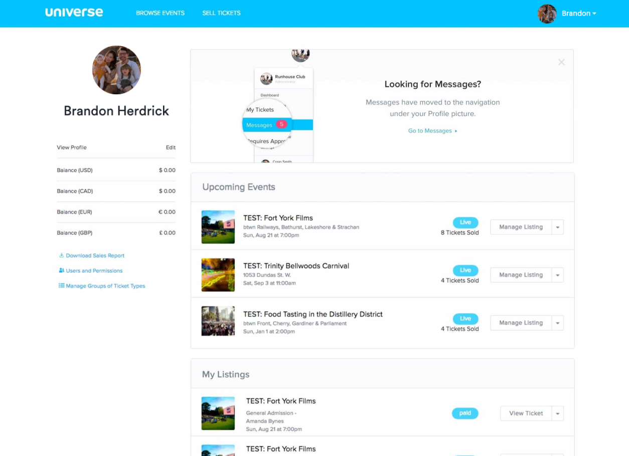
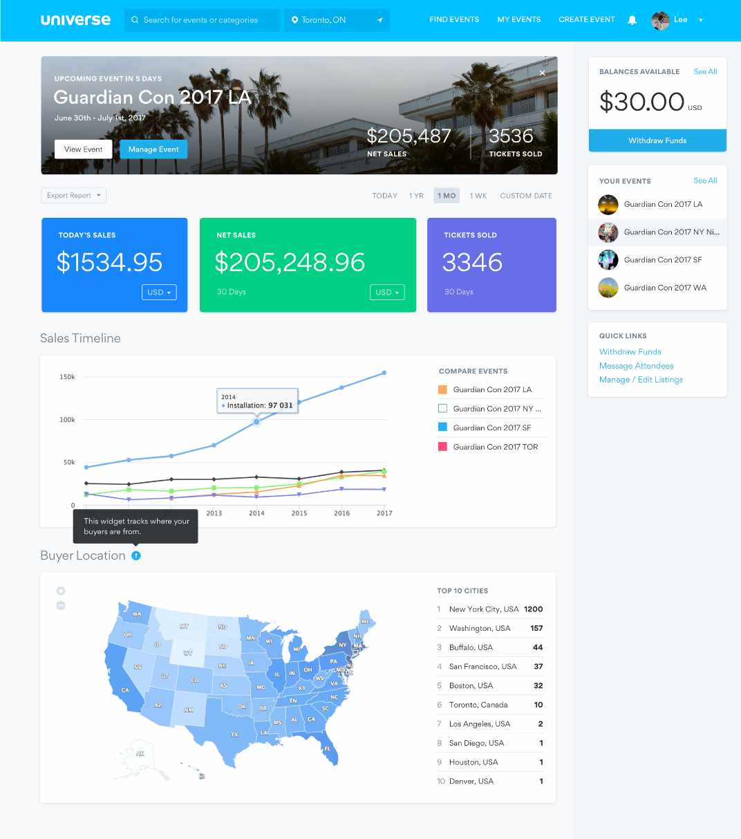
Universe’s dashboard is a feature that’s frequently seen by users as it is the first page one would land upon when they login. However, our data shows that majority of our users spend very little time on this page as we suspect it did little to add value to their experience, which suggested potential room for improvement in adding substantial value to their experience.
Talking to Users
Recognizing the significant difference between the personas of Event Organizers versus Attendees, we strategically identified Event Organizers as our primary target users.
In order to gain a deeper understanding of this persona, we engaged with our existing customers who host a diverse range of events in terms of size, frequency, and type. This invaluable feedback allowed us to gain insights into how they utilized our current dashboard and the specific value they sought from it. We learned that this type of organizer hosted multiple events and had recurring classes/workshops, attractions, and venue-based events.
It became evident that the dashboard was incorrectly focused, mostly catering to Attendees. We found that Attendees would navigate to this page to access their tickets while Event Organizers would use this page as an index of their events.
Analyzing these pain points, it became evident that the dashboard lacked global-level data for all an organizer's events. Additionally, certain functionalities seemed out of place, and the visual presentation lacked a clear hierarchy and priority.
To address these shortcomings, I conducted a competitive analysis of dashboards on other popular platforms, extracting key insights for an enhanced design. Successful dashboards featured well-structured navigation, actionable and informative data, timelines with filterable insights, and milestones highlighting crucial insights.
Main Objective
My research uncovered that a large portion of users were logging in on mobile, so we determined that our primary objective should be to increase daily and mobile activity from Event Organizers.
The enhancement of the dashboard held significant importance for us as it directly addresses and alleviates the pain points faced by Event Organizers throughout their event lifecycle, from the initial launch to the preparation for subsequent events.
Starting with Questions...
We created a list of ‘How Might We…’ questions to help us better align our user’s tasks and goals:
How might we provide an experience that is engaging and valuable to our users?
How might we allow them to access their most critical event information through their mobile devices?
How might we provide a tailored experience that allows organizers to see what’s most important to them?
Lorem ipsum dolor sit amet, consectetur adipiscing elit, sed do eiusmod tempor incididunt ut labore et dolore magna aliqua. Ut enim ad minim veniam, quis nostrud exercitation ullamco laboris nisi ut aliquip ex ea commodo consequat. Duis aute irure dolor in reprehenderit in voluptate velit esse cillum dolore eu fugiat nulla pariatur. Excepteur sint occaecat cupidatat non proident, sunt in culpa qui officia deserunt mollit anim id est laborum.
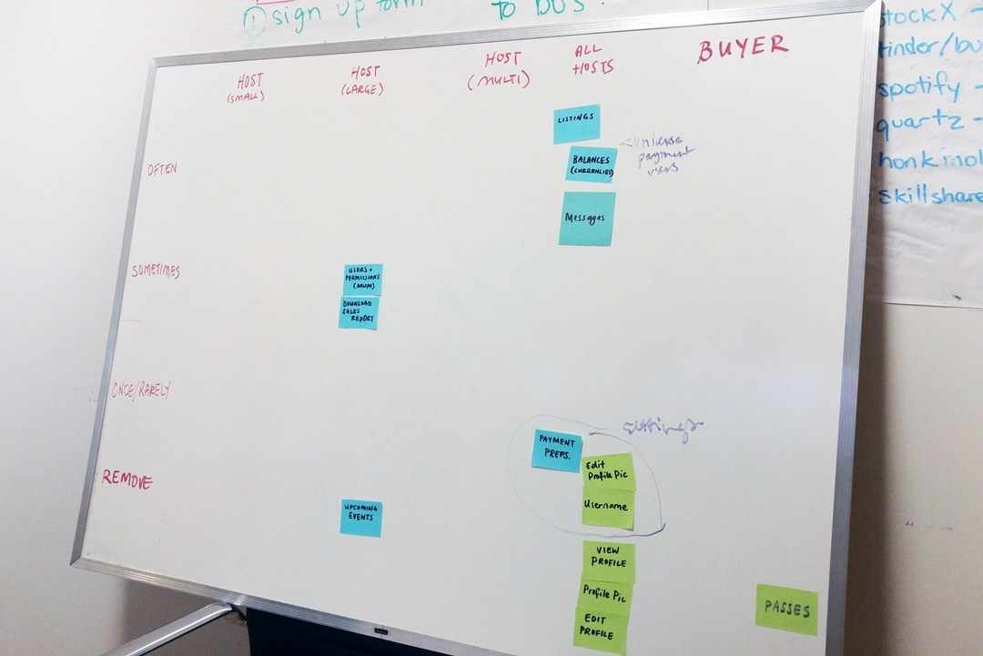
Card Sorting
I conducted a card sorting session that was composed of members from our Sales and Support teams in order to determine which functionalities of the dashboard should remain, which should be relocated, and which should be eliminated. By leveraging these insights, I was able to reevaluate the platform’s information architecture and determine how much value each item was adding to the dashboard.
Title Case Title
Lorem ipsum dolor sit amet, consectetur adipiscing elit, sed do eiusmod tempor incididunt ut labore et dolore magna aliqua. Ut enim ad minim veniam, quis nostrud exercitation ullamco laboris nisi ut aliquip ex ea commodo consequat. Duis aute irure dolor in reprehenderit in voluptate velit esse cillum dolore eu fugiat nulla pariatur. Excepteur sint occaecat cupidatat non proident, sunt in culpa qui officia deserunt mollit anim id est laborum.
Internal Feedback
I surveyed our client-facing teammates to swiftly gather insights on potential additions or removals from our dashboard. The goal was to identify quick wins—simple improvements that could be executed promptly.
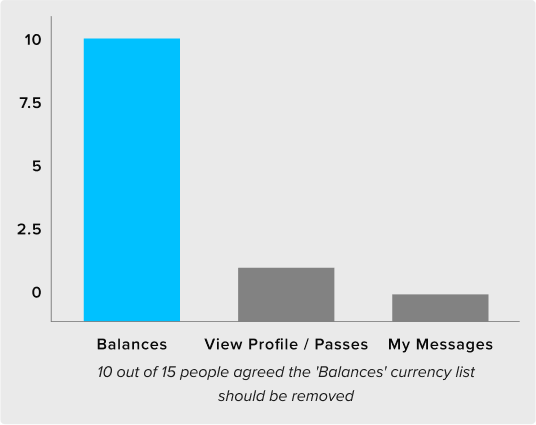
Feedback highlighted the suggestion to avoid displaying balances when an Event Organizer has no funds to withdraw, eliminating the presentation of empty data to users. Additionally, a notable feature request emerged: the ability to export a report detailing global-level sales and overall revenue.
The MVP
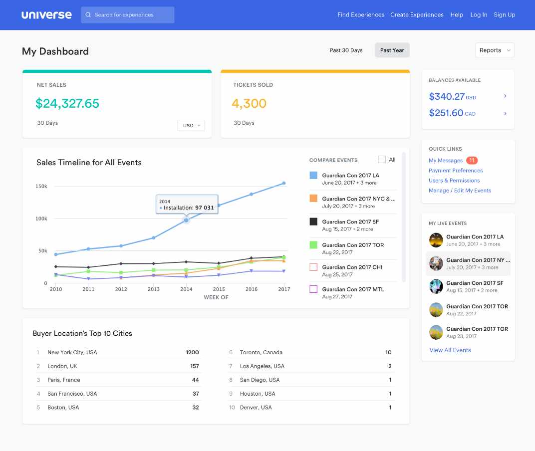
To validate these findings, I designed a simple overview of the user’s net sales and tickets sold. My design also included the option to export reports for the data points, while strategically removing the features discussed in our ‘Card Sorting’ session. Following a soft launch to a select group of actual users, we observed an immediate impact. Our clients not only expressed the usefulness of these additions but, more significantly, we witnessed a noticeable decrease in drop-offs on the dashboard.
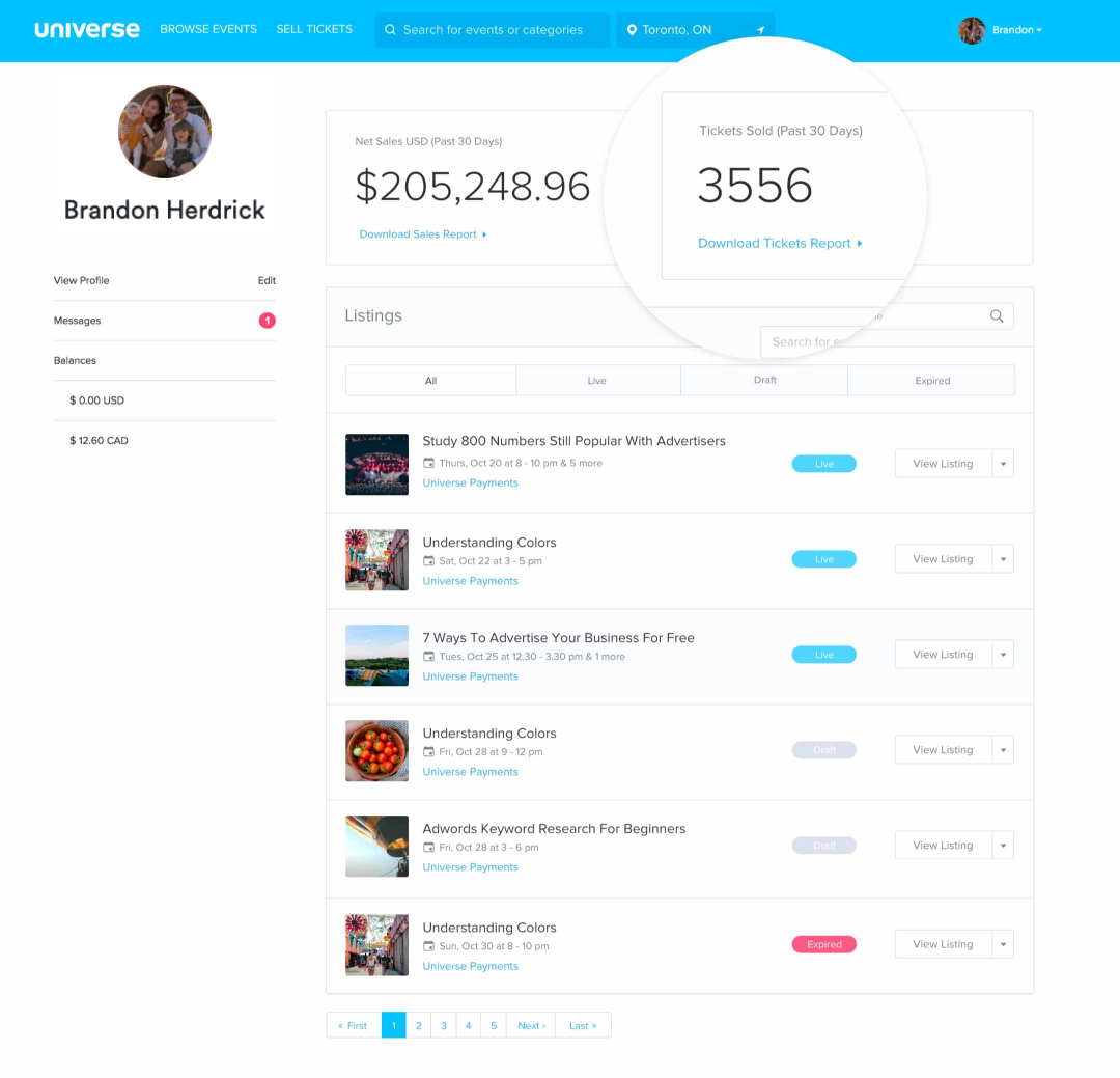
The MVP version with net sales, tickets sold and a simplified sidebar
Iterate, Iterate and Iterate
Based on our all of our findings shown above, we narrowed our focus into 4 areas for potential improvement of our original dashboard:
- Improve the data we provide
- Improve navigation
- Improve actionability
- Improve notification
Improve the data we provide
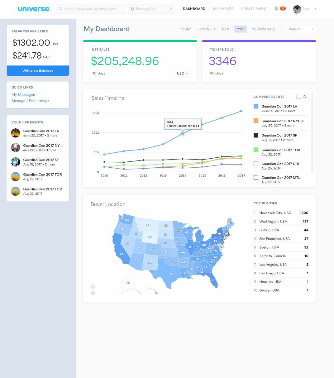
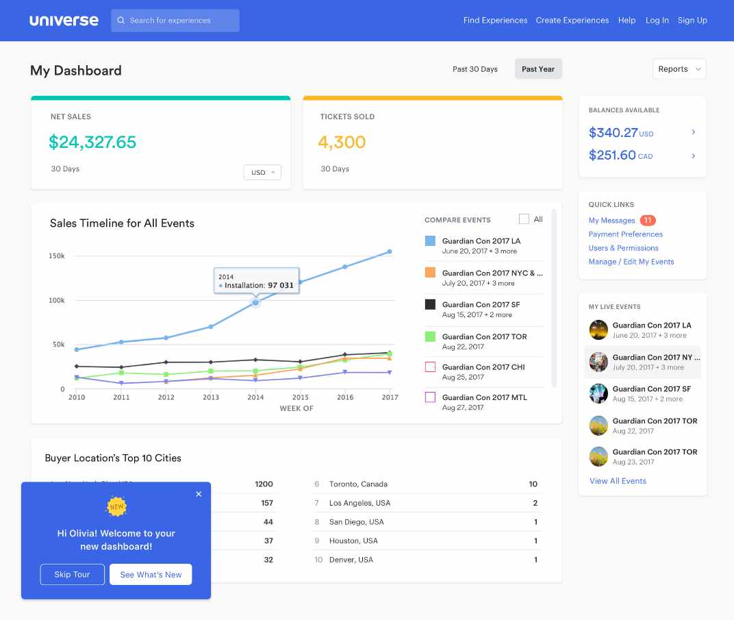
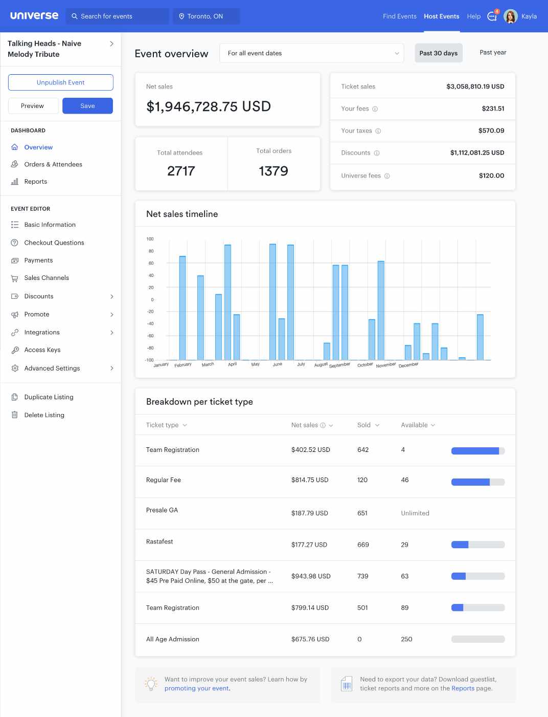
From my findings, it became evident that a significant majority of our clients want more detailed insights into their daily sales, buyer demographics, and a means to compare multiple ongoing events. To cater to this demand, I aimed to present the data in a visually appealing and digestible format. Adhering to technical constraints, I ensured the utilization of charts and graphs from an existing library to maintain efficiency and integration within our platform.
Improve navigation
As part of the dashboard redesign, I incorporated a sidebar featuring quick links frequently visited by organizers. Simultaneously, I maintained an index of their upcoming events.
Improve actionability
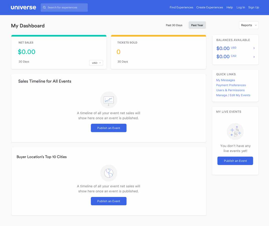
I introduced innovative solutions that addressed the questions: ‘What can Event Organizers do once their event is over?’ and ‘What happens when there are no upcoming events?’. This included helping guide and enhance the experience by prompting the user with tips during different states of an event’s period, especially when a dashboard is empty.
Improve notification
In addition, I focused on enhancing communication by implementing notifications that keep users informed about critical milestones in their event. Key notifications include real-time insights on tickets sold for the day and immediate alerts whenever a new message is received from a buyer.
Version 1: In-app announcements and laying out content in cards
Version 2: Exploring more subtle colors
Challenges and Compromises
Navigating the challenges of limited resources and time, a common struggle for startups, we consistently iterate our designs to align with achievable goals within these constraints.
- In one version, I intended to include a map showcasing the geographical locations of an event's top buyers. Recognizing the need for efficiency, this was refined to a more attainable solution—a list highlighting the locations of these buyers.
- I initially included in-app messaging, showing summaries of your event once it ended. Through discussions with developers, we determined that the complexity and logic would require too much time. Therefore, we transformed this into a post-event email summarizing net sales and tickets sold.
The latest iteration of the dashboard
Action based empty states were incorporated
Onboarding the new dashboard in a non-disruptive UI
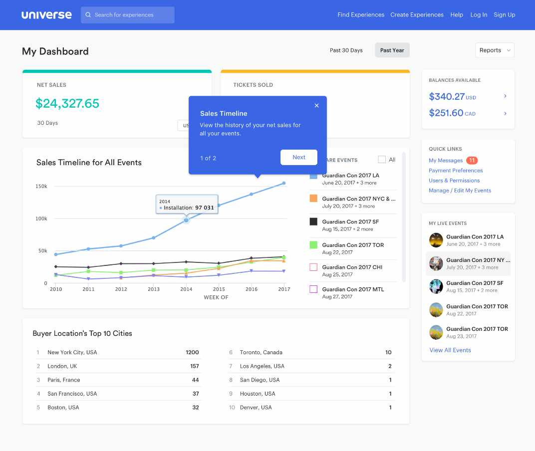
Onboarding the new dashboard using tooltips
Future Recommendations
While the dashboard was extremely well received by the users, there were still improvements that I recommended for exploration. One example was that an event organizer should be able to filter their data even more, and customize the view based on their needs. I created flexibility in my design to allow for additional enhancements to be included in later releases.
Making a home for Account Level Discount Codes
Inspiring the Event Level Dashboard

Next project
Volvo Trucks


Universe Dashboard
Redesigning How Event Organizers Access and Analyze Data
Event organizers have traditionally used Universe because of its reliability in setting up events quickly and selling tickets.
However, we found that the support beyond the event launch was lacking. Once an event concludes, we wanted to organizers to be able to track their success and optimize for their next event.
Universe’s dashboard is a feature that’s frequently seen by users as it is the first page one would land upon when they login. However, our data shows that majority of our users spend very little time on this page as we suspect it did little to add value to their experience, which suggested potential room for improvement in adding substantial value to their experience.
Talking to Users
Recognizing the significant difference between the personas of Event Organizers versus Attendees, we strategically identified Event Organizers as our primary target users.
In order to gain a deeper understanding of this persona, we engaged with our existing customers who host a diverse range of events in terms of size, frequency, and type. This invaluable feedback allowed us to gain insights into how they utilized our current dashboard and the specific value they sought from it. We learned that this type of organizer hosted multiple events and had recurring classes/workshops, attractions, and venue-based events.
It became evident that the dashboard was incorrectly focused, mostly catering to Attendees. We found that Attendees would navigate to this page to access their tickets while Event Organizers would use this page as an index of their events.
Analyzing these pain points, it became evident that the dashboard lacked global-level data for all an organizer's events. Additionally, certain functionalities seemed out of place, and the visual presentation lacked a clear hierarchy and priority.
To address these shortcomings, I conducted a competitive analysis of dashboards on other popular platforms, extracting key insights for an enhanced design. Successful dashboards featured well-structured navigation, actionable and informative data, timelines with filterable insights, and milestones highlighting crucial insights.
Main Objective
My research uncovered that a large portion of users were logging in on mobile, so we determined that our primary objective should be to increase daily and mobile activity from Event Organizers.
The enhancement of the dashboard held significant importance for us as it directly addresses and alleviates the pain points faced by Event Organizers throughout their event lifecycle, from the initial launch to the preparation for subsequent events.
Starting with Questions...
We created a list of ‘How Might We…’ questions to help us better align our user’s tasks and goals:
How might we provide an experience that is engaging and valuable to our users?
How might we allow them to access their most critical event information through their mobile devices?
How might we provide a tailored experience that allows organizers to see what’s most important to them?
Lorem ipsum dolor sit amet, consectetur adipiscing elit, sed do eiusmod tempor incididunt ut labore et dolore magna aliqua. Ut enim ad minim veniam, quis nostrud exercitation ullamco laboris nisi ut aliquip ex ea commodo consequat. Duis aute irure dolor in reprehenderit in voluptate velit esse cillum dolore eu fugiat nulla pariatur. Excepteur sint occaecat cupidatat non proident, sunt in culpa qui officia deserunt mollit anim id est laborum.
Card Sorting
I conducted a card sorting session that was composed of members from our Sales and Support teams in order to determine which functionalities of the dashboard should remain, which should be relocated, and which should be eliminated. By leveraging these insights, I was able to reevaluate the platform’s information architecture and determine how much value each item was adding to the dashboard.
Title Case Title
Lorem ipsum dolor sit amet, consectetur adipiscing elit, sed do eiusmod tempor incididunt ut labore et dolore magna aliqua. Ut enim ad minim veniam, quis nostrud exercitation ullamco laboris nisi ut aliquip ex ea commodo consequat. Duis aute irure dolor in reprehenderit in voluptate velit esse cillum dolore eu fugiat nulla pariatur. Excepteur sint occaecat cupidatat non proident, sunt in culpa qui officia deserunt mollit anim id est laborum.
Internal Feedback
I surveyed our client-facing teammates to swiftly gather insights on potential additions or removals from our dashboard. The goal was to identify quick wins—simple improvements that could be executed promptly.
Feedback highlighted the suggestion to avoid displaying balances when an Event Organizer has no funds to withdraw, eliminating the presentation of empty data to users. Additionally, a notable feature request emerged: the ability to export a report detailing global-level sales and overall revenue.
The MVP
To validate these findings, I designed a simple overview of the user’s net sales and tickets sold. My design also included the option to export reports for the data points, while strategically removing the features discussed in our ‘Card Sorting’ session. Following a soft launch to a select group of actual users, we observed an immediate impact. Our clients not only expressed the usefulness of these additions but, more significantly, we witnessed a noticeable decrease in drop-offs on the dashboard.
The MVP version with net sales, tickets sold and a simplified sidebar
Iterate, Iterate and Iterate
Based on our all of our findings shown above, we narrowed our focus into 4 areas for potential improvement of our original dashboard:
- Improve the data we provide
- Improve navigation
- Improve actionability
- Improve notification
Improve the data we provide
From my findings, it became evident that a significant majority of our clients want more detailed insights into their daily sales, buyer demographics, and a means to compare multiple ongoing events. To cater to this demand, I aimed to present the data in a visually appealing and digestible format. Adhering to technical constraints, I ensured the utilization of charts and graphs from an existing library to maintain efficiency and integration within our platform.
Improve navigation
As part of the dashboard redesign, I incorporated a sidebar featuring quick links frequently visited by organizers. Simultaneously, I maintained an index of their upcoming events.
Improve actionability
I introduced innovative solutions that addressed the questions: ‘What can Event Organizers do once their event is over?’ and ‘What happens when there are no upcoming events?’. This included helping guide and enhance the experience by prompting the user with tips during different states of an event’s period, especially when a dashboard is empty.
Improve notification
In addition, I focused on enhancing communication by implementing notifications that keep users informed about critical milestones in their event. Key notifications include real-time insights on tickets sold for the day and immediate alerts whenever a new message is received from a buyer.
Version 1: In-app announcements and laying out content in cards
Version 2: Exploring more subtle colors
Challenges and Compromises
Navigating the challenges of limited resources and time, a common struggle for startups, we consistently iterate our designs to align with achievable goals within these constraints.
- In one version, I intended to include a map showcasing the geographical locations of an event's top buyers. Recognizing the need for efficiency, this was refined to a more attainable solution—a list highlighting the locations of these buyers.
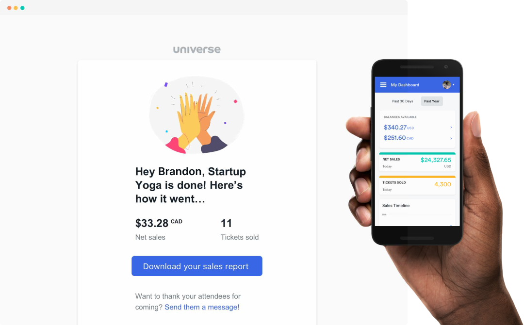
- I initially included in-app messaging, showing summaries of your event once it ended. Through discussions with developers, we determined that the complexity and logic would require too much time. Therefore, we transformed this into a post-event email summarizing net sales and tickets sold.
The latest iteration of the dashboard
Action based empty states were incorporated
Onboarding the new dashboard in a non-disruptive UI
Onboarding the new dashboard using tooltips
Future Recommendations
While the dashboard was extremely well received by the users, there were still improvements that I recommended for exploration. One example was that an event organizer should be able to filter their data even more, and customize the view based on their needs. I created flexibility in my design to allow for additional enhancements to be included in later releases.
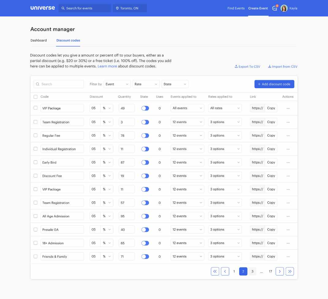
Making a home for Account Level Discount Codes
Inspiring the Event Level Dashboard
Next project
Volvo Trucks
Universe Dashboard
Redesigning How Event Organizers Access and Analyze Data
Event organizers have traditionally used Universe because of its reliability in setting up events quickly and selling tickets.
However, we found that the support beyond the event launch was lacking. Once an event concludes, we wanted to organizers to be able to track their success and optimize for their next event.
Universe’s dashboard is a feature that’s frequently seen by users as it is the first page one would land upon when they login. However, our data shows that majority of our users spend very little time on this page as we suspect it did little to add value to their experience, which suggested potential room for improvement in adding substantial value to their experience.
Talking to Users
Recognizing the significant difference between the personas of Event Organizers versus Attendees, we strategically identified Event Organizers as our primary target users.
In order to gain a deeper understanding of this persona, we engaged with our existing customers who host a diverse range of events in terms of size, frequency, and type. This invaluable feedback allowed us to gain insights into how they utilized our current dashboard and the specific value they sought from it. We learned that this type of organizer hosted multiple events and had recurring classes/workshops, attractions, and venue-based events.
It became evident that the dashboard was incorrectly focused, mostly catering to Attendees. We found that Attendees would navigate to this page to access their tickets while Event Organizers would use this page as an index of their events.
Analyzing these pain points, it became evident that the dashboard lacked global-level data for all an organizer's events. Additionally, certain functionalities seemed out of place, and the visual presentation lacked a clear hierarchy and priority.
To address these shortcomings, I conducted a competitive analysis of dashboards on other popular platforms, extracting key insights for an enhanced design. Successful dashboards featured well-structured navigation, actionable and informative data, timelines with filterable insights, and milestones highlighting crucial insights.
Main Objective
My research uncovered that a large portion of users were logging in on mobile, so we determined that our primary objective should be to increase daily and mobile activity from Event Organizers.
The enhancement of the dashboard held significant importance for us as it directly addresses and alleviates the pain points faced by Event Organizers throughout their event lifecycle, from the initial launch to the preparation for subsequent events.
Starting with Questions...
We created a list of ‘How Might We…’ questions to help us better align our user’s tasks and goals:
How might we provide an experience that is engaging and valuable to our users?
How might we allow them to access their most critical event information through their mobile devices?
How might we provide a tailored experience that allows organizers to see what’s most important to them?
Lorem ipsum dolor sit amet, consectetur adipiscing elit, sed do eiusmod tempor incididunt ut labore et dolore magna aliqua. Ut enim ad minim veniam, quis nostrud exercitation ullamco laboris nisi ut aliquip ex ea commodo consequat. Duis aute irure dolor in reprehenderit in voluptate velit esse cillum dolore eu fugiat nulla pariatur. Excepteur sint occaecat cupidatat non proident, sunt in culpa qui officia deserunt mollit anim id est laborum.
Card Sorting
I conducted a card sorting session that was composed of members from our Sales and Support teams in order to determine which functionalities of the dashboard should remain, which should be relocated, and which should be eliminated. By leveraging these insights, I was able to reevaluate the platform’s information architecture and determine how much value each item was adding to the dashboard.
Title Case Title
Lorem ipsum dolor sit amet, consectetur adipiscing elit, sed do eiusmod tempor incididunt ut labore et dolore magna aliqua. Ut enim ad minim veniam, quis nostrud exercitation ullamco laboris nisi ut aliquip ex ea commodo consequat. Duis aute irure dolor in reprehenderit in voluptate velit esse cillum dolore eu fugiat nulla pariatur. Excepteur sint occaecat cupidatat non proident, sunt in culpa qui officia deserunt mollit anim id est laborum.
Internal Feedback
I surveyed our client-facing teammates to swiftly gather insights on potential additions or removals from our dashboard. The goal was to identify quick wins—simple improvements that could be executed promptly.
Feedback highlighted the suggestion to avoid displaying balances when an Event Organizer has no funds to withdraw, eliminating the presentation of empty data to users. Additionally, a notable feature request emerged: the ability to export a report detailing global-level sales and overall revenue.
The MVP
To validate these findings, I designed a simple overview of the user’s net sales and tickets sold. My design also included the option to export reports for the data points, while strategically removing the features discussed in our ‘Card Sorting’ session. Following a soft launch to a select group of actual users, we observed an immediate impact. Our clients not only expressed the usefulness of these additions but, more significantly, we witnessed a noticeable decrease in drop-offs on the dashboard.
The MVP version with net sales, tickets sold and a simplified sidebar
Iterate, Iterate and Iterate
Based on our all of our findings shown above, we narrowed our focus into 4 areas for potential improvement of our original dashboard:
- Improve the data we provide
- Improve navigation
- Improve actionability
- Improve notification
Improve the data we provide
From my findings, it became evident that a significant majority of our clients want more detailed insights into their daily sales, buyer demographics, and a means to compare multiple ongoing events. To cater to this demand, I aimed to present the data in a visually appealing and digestible format. Adhering to technical constraints, I ensured the utilization of charts and graphs from an existing library to maintain efficiency and integration within our platform.
Improve navigation
As part of the dashboard redesign, I incorporated a sidebar featuring quick links frequently visited by organizers. Simultaneously, I maintained an index of their upcoming events.
Improve actionability
I introduced innovative solutions that addressed the questions: ‘What can Event Organizers do once their event is over?’ and ‘What happens when there are no upcoming events?’. This included helping guide and enhance the experience by prompting the user with tips during different states of an event’s period, especially when a dashboard is empty.
Improve notification
In addition, I focused on enhancing communication by implementing notifications that keep users informed about critical milestones in their event. Key notifications include real-time insights on tickets sold for the day and immediate alerts whenever a new message is received from a buyer.
Version 1: In-app announcements and laying out content in cards
Version 2: Exploring more subtle colors
Challenges and Compromises
Navigating the challenges of limited resources and time, a common struggle for startups, we consistently iterate our designs to align with achievable goals within these constraints.
- In one version, I intended to include a map showcasing the geographical locations of an event's top buyers. Recognizing the need for efficiency, this was refined to a more attainable solution—a list highlighting the locations of these buyers.
- I initially included in-app messaging, showing summaries of your event once it ended. Through discussions with developers, we determined that the complexity and logic would require too much time. Therefore, we transformed this into a post-event email summarizing net sales and tickets sold.
The latest iteration of the dashboard
Action based empty states were incorporated
Onboarding the new dashboard in a non-disruptive UI
Onboarding the new dashboard using tooltips
Future Recommendations
While the dashboard was extremely well received by the users, there were still improvements that I recommended for exploration. One example was that an event organizer should be able to filter their data even more, and customize the view based on their needs. I created flexibility in my design to allow for additional enhancements to be included in later releases.
Making a home for Account Level Discount Codes
Inspiring the Event Level Dashboard
Next project
Volvo Trucks